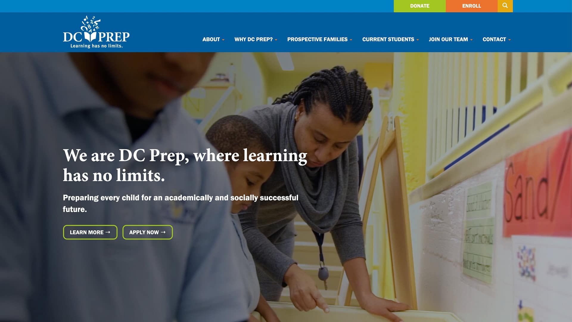
DC Prep’s mission is to bridge the educational divide in Washington, DC, by increasing the number of students from underserved communities with the academic preparation and personal character to succeed in competitive high schools and colleges.
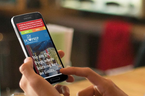
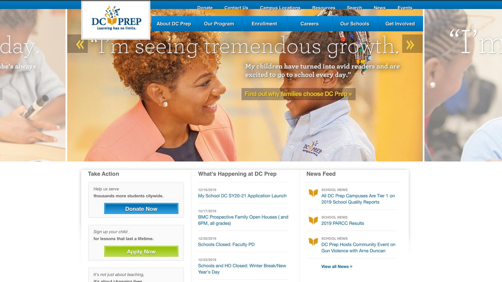
DC Prep’s old site was outdated, but the main issue was the inability to easily add pages, news, or announcements. This became a serious problem when COVID began to cause rapid changes that needed to be communicated quickly and clearly to nervous, overwhelmed families.
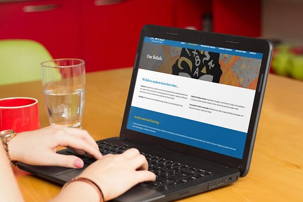
The content and structure of the site weren’t clear for prospective families, adding stress to the limited DC Prep staff as they attempted to guide parents through information that could easily be provided online.
With school closures and an enrollment drive around the corner, DC Prep came to us with an ambitious six-week turnaround time for getting a new website designed, rewritten, tested, and online.
Visit Site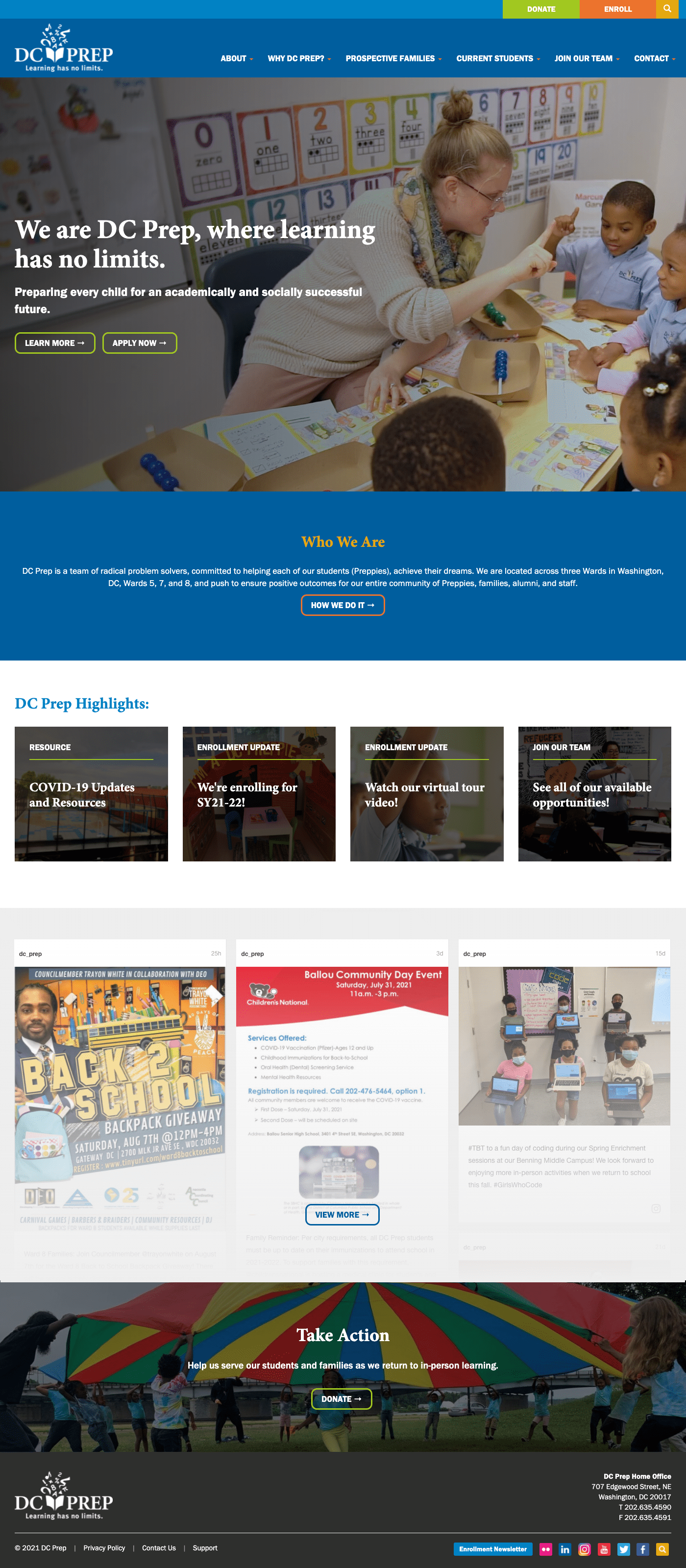


 Back to Portfolio